Judgey
Here in the Book Review Department of the Literary Arts Wing of The Memphis Flyer, we see a lot of books. Novels. Short story collections. Poetry chapbooks. Graphic novels. History. Day in and day out, packages come across my desk from Alfred A. Knopf, Penguin Random House, HarperCollins, Simon & Schuster, and self-publishers in every genre.
At the moment of arrival, they’re all the same. Brown, padded, book-shaped treasure — every one of them endless with possibilities. It isn’t until those packages are torn open and the books’ covers revealed that the hungry excitement on my face will melt away like a kid’s on Christmas when he opens the gift of socks. Yet another fictionalization of a misunderstood military sniper caught up in international intrigue? No thanks.
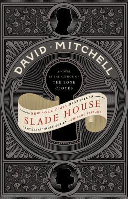
Or, perhaps, I’m elated. This was the case recently when I opened the paperback version of Slade House by David Mitchell (Random House). At this point, before the ravaged envelope had even hit the floor (the Book Review Department of the Literary Arts Wing of The Memphis Flyer is a trash-strewn mess), I knew absolutely nothing about Mitchell or his book other than it has a beautiful cover. It’s silver and black with a man and woman’s profiles cameo-style among vines and leaves. There’s a large, black keyhole across which the title in raised red letters is emblazoned on a sepia banner.
I knew immediately that I would read it. Then I read the accompanying blurbs: “haunted house story” . . . “spooky thrill ride” . . . “psycho-mystic fantasy horror.” The accompanying press kit told me more: Slade Housewas originally published in 2015, and Mitchell also wrote the novel Cloud Atlas, a book I also didn’t read made into a movie I did see, but that didn’t hold my attention; I never even considered reading its source material.
But still, there’s that cover. It drew me in, which is appropriate because, in the book, along a narrow alleyway, there’s a little iron door unseen by most — “It has no handle, keyhole, or gaps around the edges. It’s black, nothing-black, like the gaps between stars.” And when a visitor passes through, well, they may not ever return. Every nine years spanning five decades beginning in the 1970s, an enigmatic set of twins — brother and sister — brings guests into a home that may or may not exist in the plane on which we live. Those who enter include a socially awkward teenager and his mother, a detective, a college student, and a psychologist. What happens once inside that gate? I found that I had to look through that big, black keyhole to find out.
The cover haunted me, and I became absorbed with the story.
But we aren’t to judge a book by its cover. Isn’t that what we’re told? Both literally and metaphorically, what’s on the outside is only decoration, something to be shrugged off as easily as a coat or sweater.
In the earliest days of print, a book’s cover was merely protective. In the mid- to late-nineteenth century, publishers began using that space to advertise the book itself. Today, a bookstore’s shelves look like a rainbow. In an age when reading is as popular as ever, the colorful palette is meant to draw the consumer in. And because of the competition, book jackets are becoming more telling of what’s inside.
Other books I’ve judged (successfully) by their covers: The Brooklyn Follies by Paul Auster, The English Patientby Michael Ondaatje, All the Names by José Saramago, Beautiful Ruins by Jess Walter, & Sons by David Gilbert, and The Confessions of Max Tivoli by Andrew Sean Greer, among others.
Having trouble deciding on your next book to read? Visit your local bookstore, and spend some time perusing. And go ahead and judge a book by its cover. You might just be glad you did.
